The Period-Doubling Bifurcation Diagram
Hi friends,
Today, I would like to talk a bit about a particularly interesting result in chaos theory known as the Period-Doubling Bifurcation.
I certainly don't know enough about this topic to explain it fully here, for it is a surprisingly deep and beautiful result. (For excellent explanations of the science surrounding this plot, see this video by Veritasium, and the book Chaos by James Gleick.) Instead, as my first attempt at understanding this bizarre beast, I wanted to illustrate how you produce the period-doubling bifurcation diagram. I hope to learn (and write!) much more about this in the future because I think it's fascinating. I hope you will agree!
The system we will consider is the logistic map, which is given by the simple recurrence relation:
Given some starting value x0, this equation allows you to compute x1. Then from x1, you plug back in and compute x2, and so on. Why would you ever want to do such a thing? As an example, the logistic map can be used as a primitive model of population growth. We say that x_n describes the current size of your population at time n. Then x_n+1 will describe the size of your population at time n+1. Two things to note: First, each x is between 0 and 1, so these population values should be thought of as the proportion of the maximum possible population. Second, r is a parameter of the system, so we can change r and get different population dynamics.
To make this concrete, let's choose a few values of r and see how our theoretical population evolves:
Several plots of population vs. time for different values of r in the logistic map. Note that all populations start with x0 = 0.25, but our ultimate results are robust to different initial values.
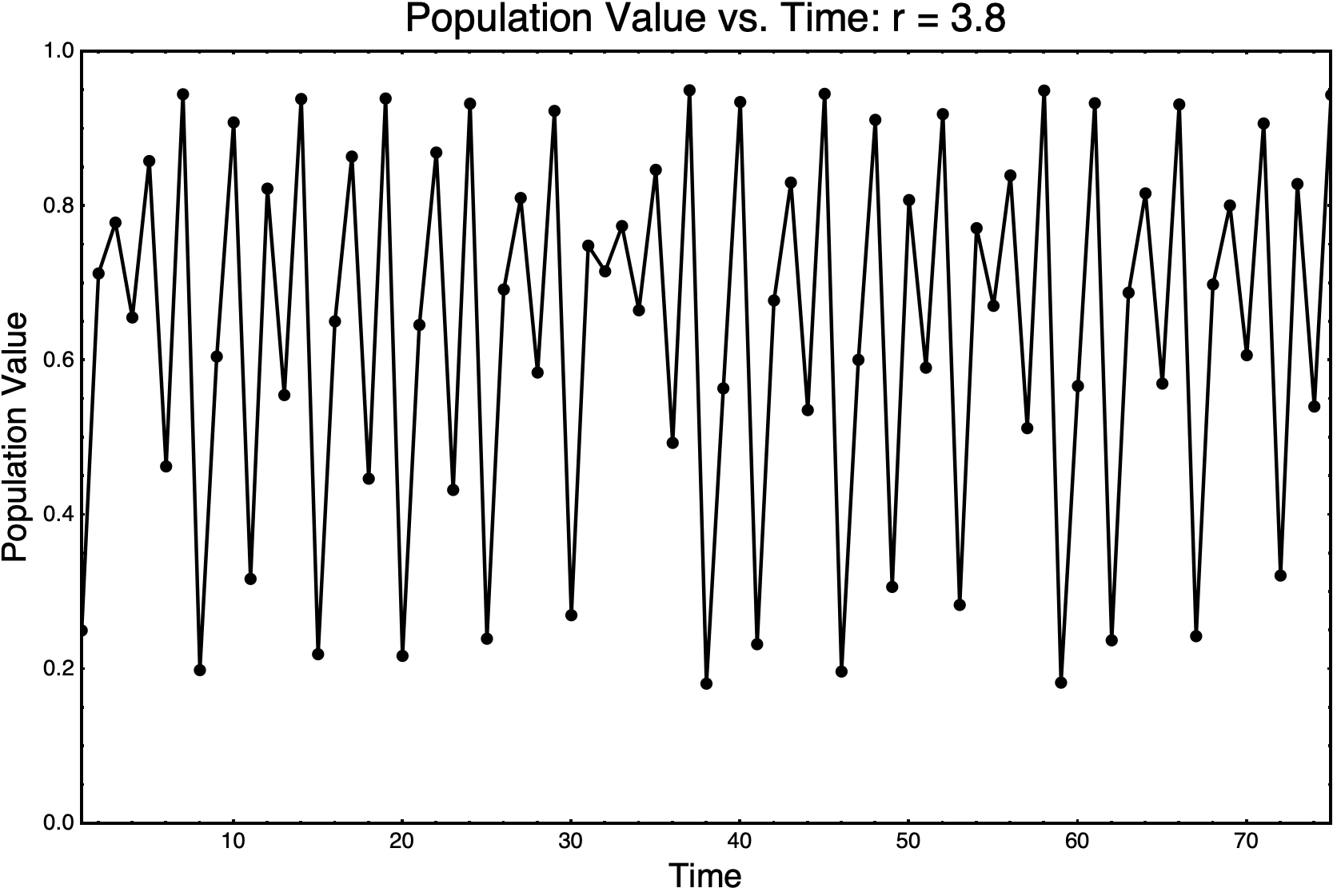
We can see that in some cases, the population quickly settles down to a nice equilibrium (r = 2). However, as we increase r, we can see that the population doesn't settle down to a single value. Indeed, in the case of r = 3.8, it does not appear to settle down at all. Here is what happens when we simulate r = 3.8 for longer.
Longer duration of population simulation for r = 3.8.
So, let's see if we can quantify precisely how this steady-state behavior varies as we vary r. (By steady-state, I just mean we ignore the transient behavior at the beginning.)
After some initial amount of time, how many values does our population take, for a given value of r? In the case of r = 2 above, we see that the population takes on just a single value. For r = 3, it takes on two. And for r = 3.5, we would already have to count very carefully to see how many values it takes on. For r = 3.8, we would certainly want to count the steady-state values programmatically. To understand our results, we plot these steady-state values as a function of r, and derive the period-doubling bifurcation diagram.
First and foremost, I think this is a beautiful plot. I certainly don’t claim to know everything that is going on here, but I find it absolutely mesmerizing to look at.
Here are a few simple observations about the period-doubling bifurcation diagram:
First, I find it extremely surprising that this much disorder and structure can be found in such a simple equation! (So did the people who discovered it, by the way!)
Second, there is not a simple trend from order to disorder in the plot. As you move along the r-axis, you get progressive bifurcations (i.e. splitting-in-twos) until the data seem completely disordered. And yet, there are definite pockets of relative order even after these points. I am not sure what causes the system to transition back to ordered behavior at these points.
Third, this diagram is actually self-similar. Looking closely at the first few bifurcations, you can begin to see that each is actually a slightly distorted copy of the whole structure
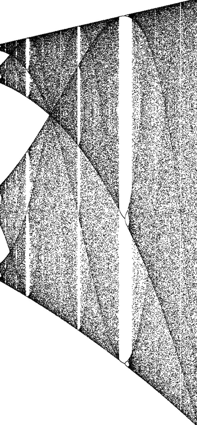
Fourth, there appear to be “threads” that extend through the whole diagram, even through the completely disordered regions. I also do not know how to make sense of these threads.
Close-up of “threads” that extend through regions of disorder in the bifurcation diagram.
For me, one of the most surprising conclusions to be drawn from this plot is that real populations could exhibit highly complex dynamics from year-to-year or season-to-season, even with a very simple updating rule like the logistic map. One might have assumed that only simple behavior could occur in a system like this, but period-doubling shows that this is manifestly not the case!
I hope you found this interesting! I certainly did. If you would like to play with the code I used to create these images, feel free to download the notebook Bifurcations.nb from my GitHub page.
Thank you for reading!
-Matt


